
Digital Alberta Briefing – Summer 2020
August 5, 2020
Edmonton Screen Industries Office offering industry support
September 7, 2020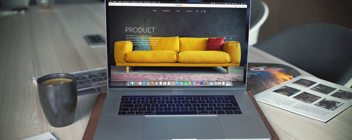
As the internet enters its fourth decade, there have been many changes (both subtle and major) to how websites present information to the public. Early on, webpages would feature endless blocks of text with flashing, colourful buttons. But now, they are now much more sparse and clean.
This is not by accident. With companies having to compete on a global scale for the dwindling attention spans of consumers, having a website that is to-the-point and simple to navigate is more important than ever.
![]() But creating something “simple” is not always easy. This is where user experience (UX) principles come into play.
But creating something “simple” is not always easy. This is where user experience (UX) principles come into play.
Todd Silver leads the UX team at Box Clever, an Edmonton-based web design company. They develop and consult on websites for a range of companies in the education, public, non-profit, and commercial sectors. In this post, Todd gives his top tips for achieving effective UX on your website.
So, what is good UX?
User experience is more than choosing the right fonts and colours. It’s about building greater empathy between an organization and its audience.
Your goal should be to create a website that instills an emotion in your user: whether that be joy, humour, or just teaching them something important. And to do this, you need to put yourself in their shoes.
What are the top UX mistakes you see companies making?
The biggest mistake I see is people building something that they want to see, without thinking about what their audience wants to see.
For example, universities often structure their website around how their departments are structured. So, to find a professor or a specific course, you have to search through the different department pages until you find the sub-page that mentions that specific professor or course. This means the most popular topics that students are looking for — like course schedules or the costs of a program — are being buried.
If the structure of your website is based on the structure of your company, you’re probably doing it wrong. Build your site for your customers, not you.
Another common mistake is for organizations to start building their websites without really thinking about what they want that website to do. You need to have clear, measurable goals, such as “increase the number of leads to funnel to our sales people”, or “decrease the number of people who don’t complete a sale.”
Figure out what your biggest priority is, and build your website to meet that priority.
How important is “accessibility”?
Accessibility is beyond being a “nice thing to do” — it’s an absolute must. Everyone, from all walks of life, are now using the internet to access important services, or do everyday things like shopping.
If you’re designing a website, and not thinking about people with different cognitive or physical abilities, you’re cutting out a huge swathe of potential customers.
So ask yourself: Do your photos and videos have written descriptions? Does your colour palette factor in people who experience visual colour deficiencies? Are your buttons and menus easy for someone with motor control issues to navigate?
Having a website that is accessible is not just the ethical thing to do, it’s also good for your business.
How would you recommend a company start a UX review of their website?
You really want to start with user testing. Get a random selection of 10 people, put them in front of your website with a specific task (i.e. buy this product from your website), and watch how they accomplish that task.
It’s good to watch their faces as they do this. I’m always amazed by the visible signs of frustration on a person’s face when they can’t find a clear way to do something on a website.
If this sounds time-consuming, you can always hire an outside consultant to run an audit like this for you.
I would also recommend learning how to read your Google Analytics. Specifically, you want to figure out which pages people are spending the most time on, and which are causing them to leave your website. Also, look at what links are getting the most clicks. This is invaluable information for improving your users’ web experience.
What are your other top tips for achieving good UX on a website?
When people think about design, they think of pictures, fonts and colours. But the written content is a huge part of the user experience.
You need to ensure your content is:
- Well-written (clear, simple, and free of jargon);
- Up-to-date;
- Contains short, quick paragraphs with lots of headings and bullets (don’t write for a book, write for a highway billboard);
- And this sounds obvious, but make sure what you write fits with what you would like the user to do. For example, if you’re selling shoes, talk about the shoes and why the customer should buy them — don’t go on about other topics.
Good navigation should also never be overlooked. You want the user to quickly reach the goal of their search with as few clicks as possible.
And finally, it’s important to remember that your job isn’t over when the site launches. You always need to keep iterating and adapting to the needs and interests of your audience.
Case Studies

District of Sicamous
“Box Clever was brought in to help the District of Sicamous create a better web experience for their diverse audiences. Their website had two primary functions, which weren’t really meshing well. On the one hand, Sicamous is a popular tourist destination, and they needed to showcase the local amenities and destinations for visitors. On the other hand, they had to make it easy for local residents to find information about municipal services, like garbage collection. We helped them build a new website that quickly funnelled visitors to their particular areas of interest.”
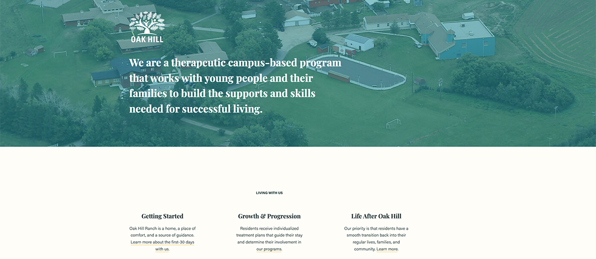
Oak Hill
“Oak Hill is a therapeutic ranch north of Edmonton that helps young people, and their families, who have gone through trauma. They have created a solutions pathway to help children heal, and transition back into their regular lives. We helped them build a website around this narrative — navigating through the kids’ needs and possible solutions. What was great about Oak Hill was that they knew exactly what the website needed to do before it was built, which ended up making for a stronger final product.”
For more information about Box Clever and the web development or UX consulting work that they do, contact them here.